Project 03 / 04University of Aveiro
CoBeF
Visual identity and social campaign for the annual Graduates' Blessing Ceremony at the University of Aveiro.
Result: 632 likes and 37 shares on three posts
- Role
- Visual identity and social content
- Client
- CoBeF, University of Aveiro
- Timeline
- 2024
- Deliverables
- Logo, campaign, social kit
01The problem
A ceremony with real emotional weight had no visual identity of its own, and a very short window to reach finalists.
02Research
- Looked at what previous years had posted: pieces made one at a time, with no identity tying them together
- Finalists saw the campaign in the feed and in stories, on a phone, often as a thumbnail between other posts
- The dates were fixed: the posts had to reach people months before the ceremony, not the week of it
03Why build it
- Why it mattered
- The ceremony happens once in a student's life, and past years had no identity holding it together. Each post competed on its own and the message got lost.
- The bet
- If every piece looks like one campaign and reads at thumbnail size, finalists will recognise it in a crowded feed and pass it on to the people coming with them.
- How I'd know it worked
- Shares, not only likes: finalists sending the posts to classmates and family.
04How I built it
Designed a logo built on unity, intention and youthful energy
WhyThe ceremony is about finishing together, so the mark had to feel like the finalists, not the institution. Unity and energy were the two feelings it had to carry.
Extended the identity into a full social campaign for the finalists
WhyA logo alone reaches nobody. The finalists live in the feed and in stories, so that is where the identity had to work, over months rather than on one poster.
Kept every piece recognisable at thumbnail size, where it was actually seen
WhyMost people met the campaign as a thumbnail between other posts. If a piece did not read small, it did not read at all.
05Why this way
A lowercase wordmark in one heavy weight
It had to read at thumbnail size and feel young, made by finalists rather than by the institution.
Set asideA crest or seal, which looks official but disappears at small sizes
Black, off-white and one green
Black and white photos carry the emotion. The green is used only for the one thing to remember, like the date.
One template, many posts
A fixed grid and two typefaces let every post go out quickly and still look like the same campaign.
06What I tested
Tested
Compared how the three posts did on the real account: 407 likes on the date, 183 on the candles, 42 on the donation drive
What changed
Announcements with a photo travelled furthest. The practical and donation posts needed a stronger image, not more text
07The campaign

_cobef and cufc.ua
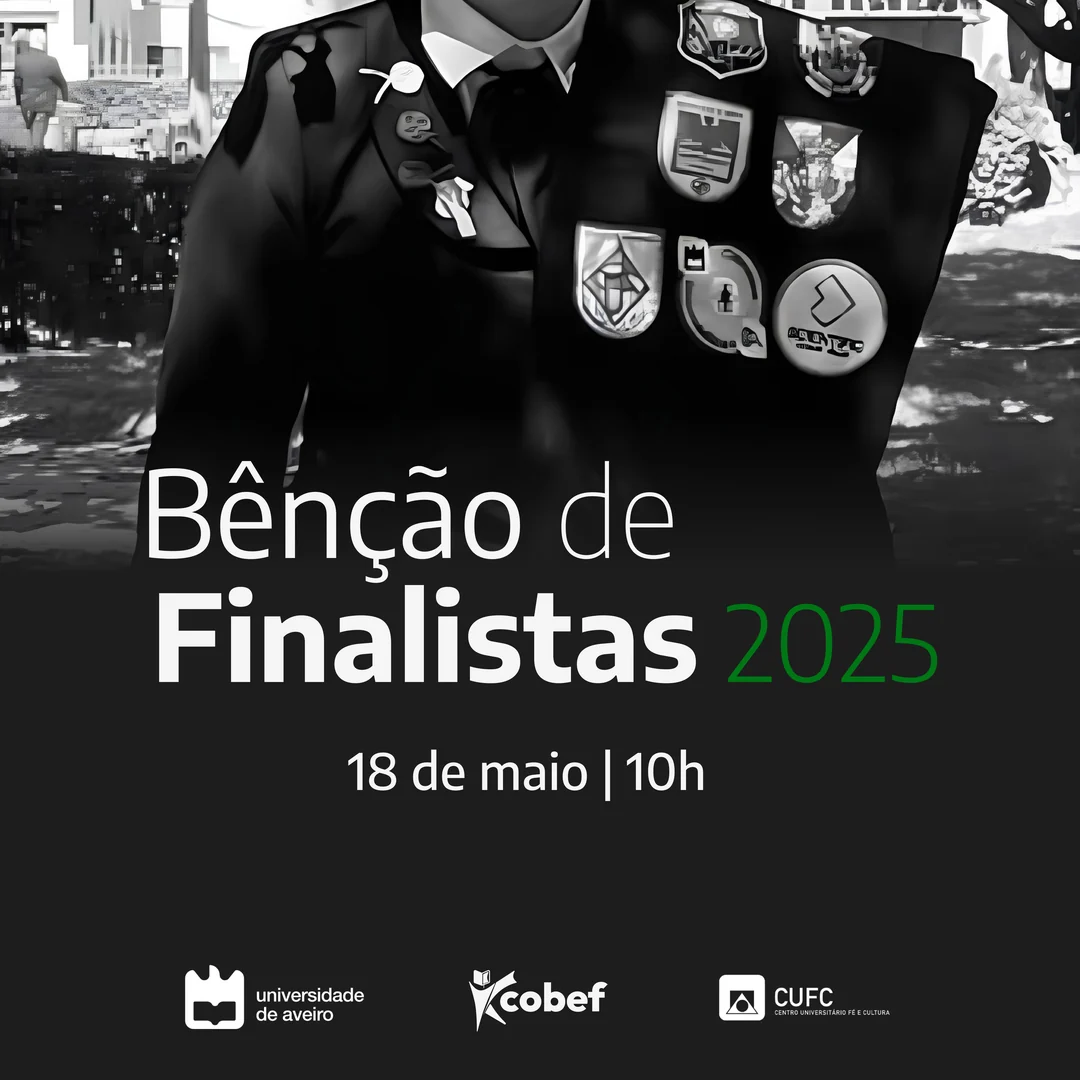
407 likes · 1 comment · 33 shares
_cobef Eeeee... Já temos data para a Bênção de Finalistas 2025!!! Tambores, por favor 🥁
23 January
_cobef and cufc.ua
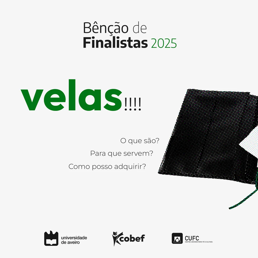
183 likes · 3 shares
_cobef 3 posts em 3 dias? Estamos a contar as streaks 🔥
24 January
_cobef and cufc.ua
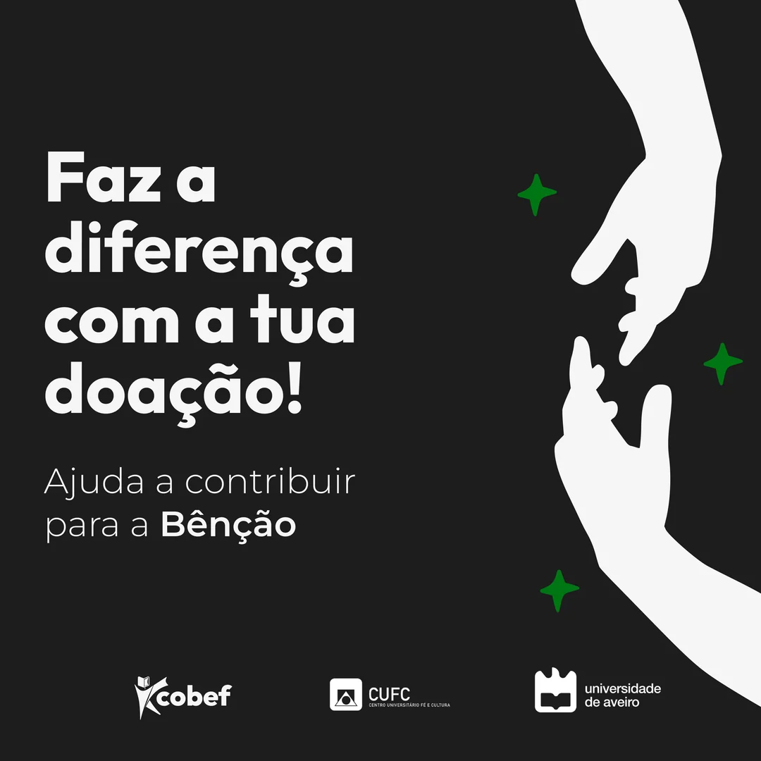
42 likes · 1 share
_cobef Faz a diferença com a tua doação e ajuda-nos a tornar a Bênção de Finalistas ainda mais especial.
30 March
632 likes and 37 shares on the real account. Double tap a post to add yours.
08The look
Colours · tap one to copy it
Typeface · write your name in it
Bênção de Finalistas 2025
cobef
09The result
A shared celebration, created by finalists for finalists, with one coherent identity. What I took from it: the post people share is the one that makes them feel something, so the emotion goes first and the information second.